Time
Building habits and getting things doneThe Problem
Struggling with low productivity
Low productivity is often attributed by fatigue, mood, inability to focus, easy access to distracting devices, and more. The problem with many existing solutions that tackle low productivity (such as pomodoro cycle trackers and sleep trackers) is that they make the assumption that aforementioned factors are independent variables. This is often not the case, as all of these factors contribute to one's overall performance during the day.
💡Opportunity: How might we improve the productivity of individuals by providing meaningful insights into their typical workflows and promoting data-driven decision making?
Role and Tools
This is a personal project that I did independently – I carried out all aspects of the projects, from the research phase to the final design.
- Pen and paper for ideation and sketches
- Sketch for interface design
Research
Talking to students, in and out of their comfort zones
To arrive at a viable solution, it was important to understand the actual users of the product. Being a student that often struggles with maximizing productivity, I wanted to validate the pain points that I personally had by conducting contextual inquiry interviews with other university students. The interviews consisted of asking subjects about their day-to-day lives, habits, and study routines while they were in a studying environment of their choice. In addition to gaining empathy, speaking with students in the environment in which they studied in allowed me to observe how their surroundings played a role in their study habits.
From the interviews, it was identified that their biggest pain points were:
- Having to balance between large amount of tasks to do for the day
- Determining what best works for them on a given day
- Spending excessive amounts of time during the day on distractions, as attributed by social media and easily accessible distracting devices
Observations made:
- Preferred to use their laptops when studying
- Most preferred to use their mobile devices during breaks
- Poor self awareness of mental well-being
Using the findings from the contextual inquiry interviews, I was able to develop a persona that best represented the target users. An empathy map for the persona was made and can be seen below:
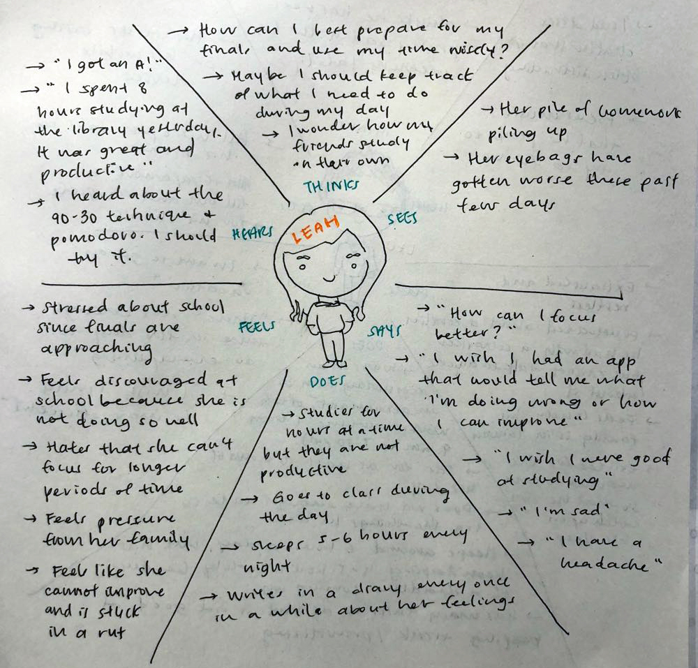
Empathy map for Leah, a university student
The University Student, Leah
- Always on the go
- Often overwhelmed with the workload
- Stressed, uses social media as an outlet
- Easily distracted
- Inefficient studying; plays by ear often
With this persona in mind, I came up with a list of user goals.
As a user, I want to:
- Ensure I am getting the sleep I need
- Know what my time is being spent on, whether it be on distractions or tasks
- Increase my self awareness and look after my mental health
- Learn to prioritize to avoid being overwhelmed
- Focus on the task at hand and study without disruptions
Options Considered
For the next step, I began to brainstorm the various forms that this solution could come in and listed out the pros and cons of each option. Options considered include a Google Chrome extension, a desktop app, a mobile app, and lastly a mobile app + Google Chrome extension duo.
In the end, I chose the last option (mobile app + Google Chrome extension duo) because it was the most appropriate for the target users. Based on the interviews conducted, it was validated that university students use both their laptops and mobile devices for roughly the same amount of time, but for different purposes. Students preferred to use their laptops during studying because of the larger screens and faster access to information. However, students would switch to using their mobile devices during breaks, as they are more portable and can be used as the students go on a quick stroll. For that reason, it was determined that using both a mobile app and Chrome extension would be most accurate in recording the amount of time spent on distractions and tasks, given the two scenarios. The mobile app would also be able to capture time spent on apps that are not available on desktops, such as Snapchat.
Workflow
Due to time constraints, I decided to focus on the mobile experience and created a draft of what the experience would look like. This allowed me to get a high level overview of the app features and also helped with determining the information hierarchy.
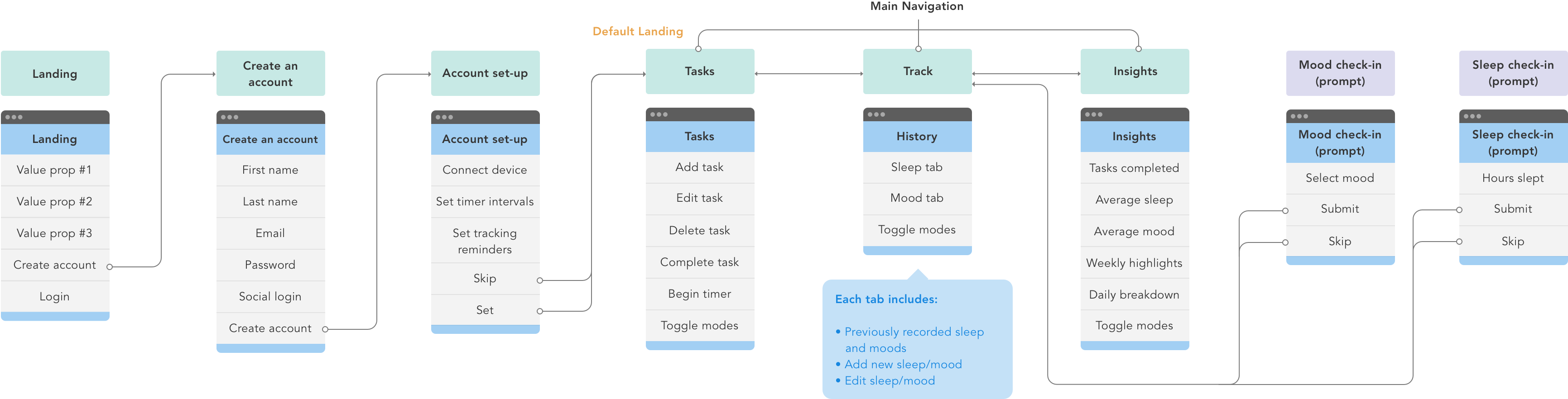
App workflow
Initial Wireframes
Next, I dived straight into sketching some initial wireframes for what the core features would look like. I explored with different input types, design patterns, and data visualizations.
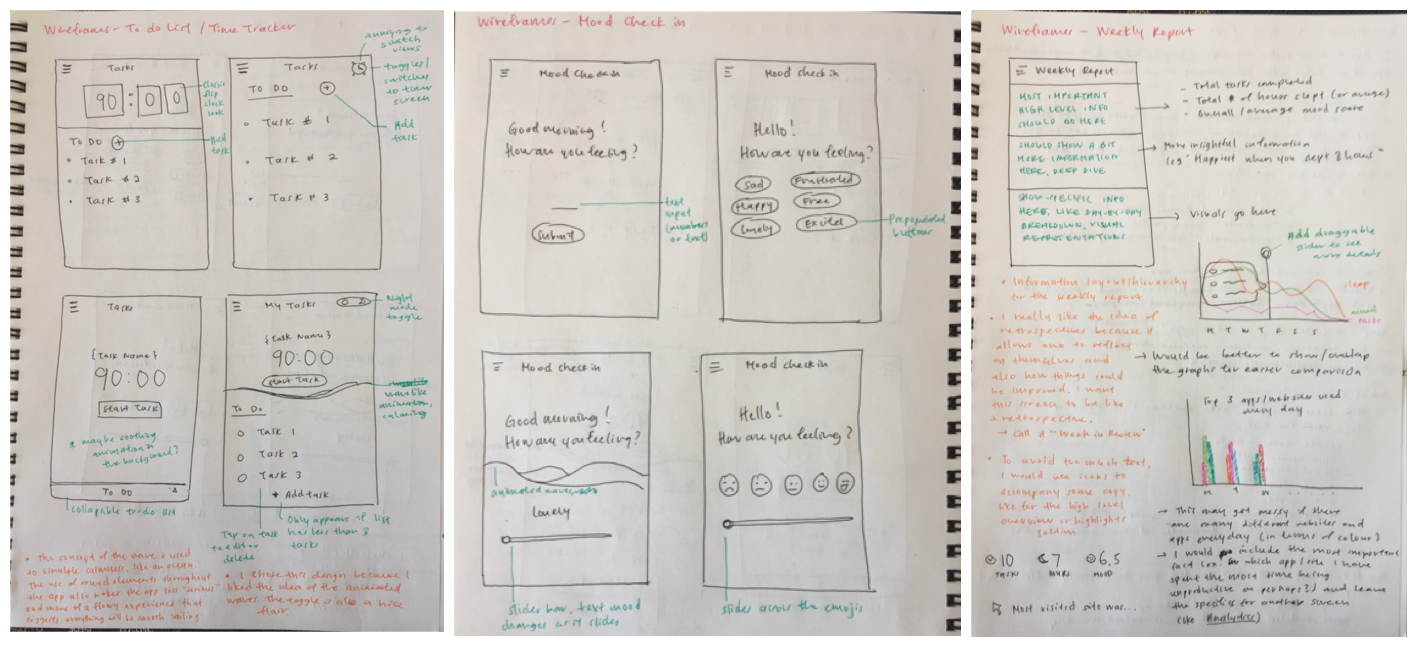
Initial wireframes
Prototyping & Testing
After some refinement, I created medium-fidelity mockups for the end-to-end experience of the solution and prototyped it on InVision (view prototype here). I used this prototype to conduct user testing with several fellow classmates and recorded their feedback and thoughts as they navigated about the app.
Some sections of the app, such as the Insights screen, were intentionally left blank; this was so that when users landed on said sections, I would take the opportunity to ask the users what they expected to see. This was especially helpful for determining the best way to visualize the users' data on the Insights screen.
Some feedback that I received were:
- "Account setup is lengthy. Do I have to configure my settings?
- "I don't want to do this right now but I also can't seem to skip this"
- "I want to be able to see how today's progress differs from yesterday's and the day before"
- "I would like to see my progress over a long period of time, like a month"
The Solution
Allowing students to build habits, prioritize tasks, and make data-driven lifestyle changes
After iterating based on the feedback received, the resulting design was a mobile app that collects, monitors, and tracks user behaviours. It also provides weekly insights that encourages positive lifestyle changes moving forward.
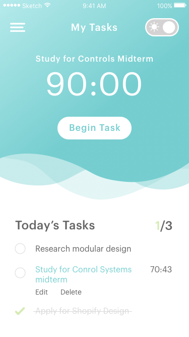
My Tasks
Students are often overwhelmed by the sheer amount of tasks they need to accomplish for the day, inducing stressed behaviours and demotivates students as they struggle to juggle between what tasks to complete first. To tackle this problem, students are prompted to enter their top three tasks to do for the day. This teaches them to better prioritize their tasks, reducing work overload and establishes focus for the day. Students can also use the built-in Pomodoro tracker to track how much time is spent on completing each task.
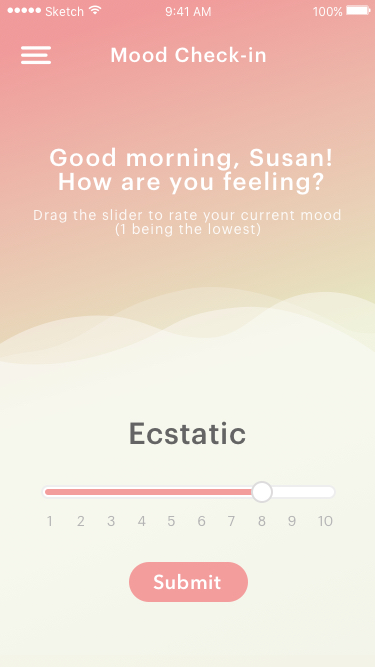
Mood Tracker
Amidst a busy day, students are typically out of tune with how they feel throughout the day; therefore to ensure that these moods are recorded often, students will be prompted to rate their current mood throughout the day at cheduled intervals.
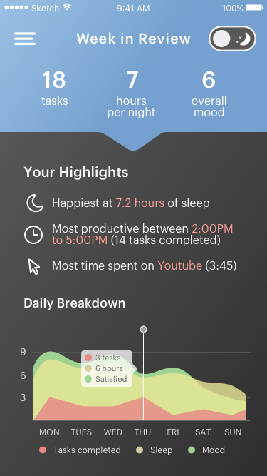
Week in Review
To encourage positive lifestyle changes for students, a weekly report containing insights as inferred by the student’s habits and internet usage is presented. This allows students to be aware of and recognize the best conditions in which they work most effectively in, where this newfound knowledge can be used to adopt better habits for the week to come. An interactive graph displaying the student's progress for the last week is also shown for easy comparison.
As part of a design exercise to challenge myself, I also created a hypothetical landing page for this app. Designing this landing page has allowed me to be more mindful of typgraphy, layout, and copy.
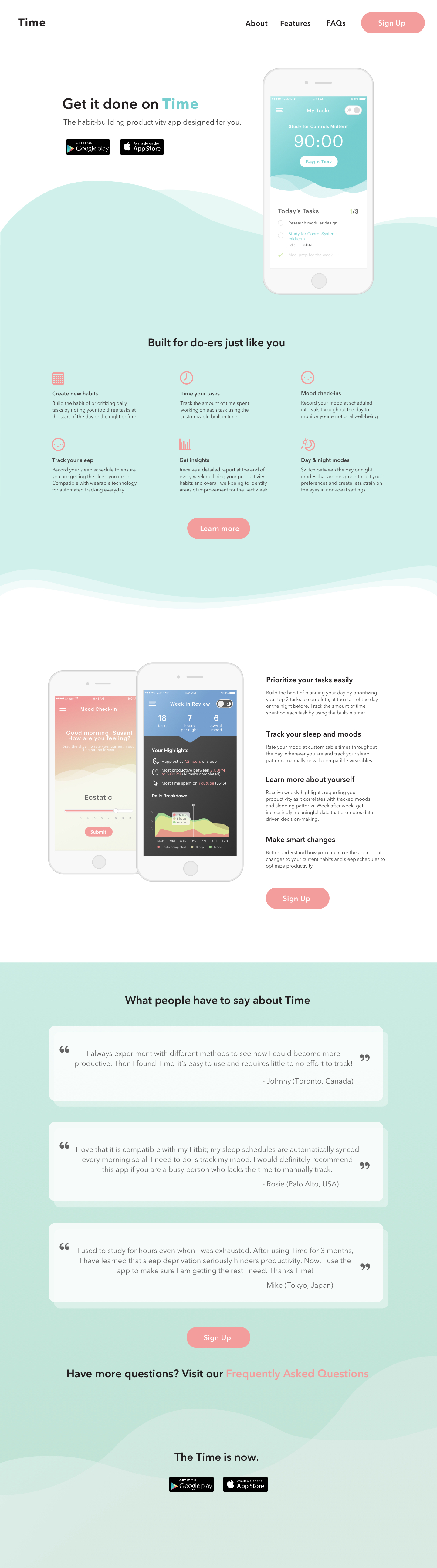
Landing page design exercise
Next Steps
Looking back, there are several changes that I would make to improve the mobile experience:
- Passive, rather than reactive. The solution takes a more passive approach in the sense that it may still be unclear what students can do next to improve their productivity. A possible solution to address this may be providing students with personalized and actionable tips pertaining to their specific habits that they may adopt moving forward.
- Moods are subjective. As a predefined mood is assigned to every numerical value on the linear scale on the Mood prompt, users may not necessarily agree with the assignments, resulting in skewed responses. To address this, I would remove the predefined moods and provide users the option of adding a personal note each time they rate their mood. That way, there is context into why they are feeling the way they are at a point in time.
- Lack of long term insights. Currently, students can only see their progress over the last week. As noted during user testing, having the ability to observe how the user's progress has evolved over a longer period of time is essential in the development of long term habits. To address this, I would do further exploration into how users can check their progress for the long term
Lastly, the next step is the design of the Chrome extension and envisioning how that experience would look like.