Sprout Health Risk Assessment
Helping you identify your health risks and guiding you towards a healthier lifestyle
The Story
I interned at Sprout as a Product Designer in Fall 2016.
Sprout is a leading Corporate Wellness Engagement platform that allows corporations to promote healthier and happier lifestyles for their employees, leading to higher productivity and overall satisfaction while on the job. Employees can use the Sprout platform to track activities, join challenges, and join communities consisting of employees that share similar interests.
The Problem
Identifying health risks
Sprout is a leading corporate wellness engagement platform that allows corporations to promote healthier and happier lifestyles for their employees by tracking activities and joining challenges and communities. The Sprout Health Risk Assessment (HRA) is a survey that asks users a series of questions regarding their health and lifestyles with the intention of determining risks and providing recommendations on how to mitigate such risks. Being a completely new feature that is to be introduced into the registration flow, the challenge was designing the flow and user interfaces of the actual assessment.
Role and Tools
For this project, I worked alongside another designer but was primarily responsible for designing the workflow, interfaces, and illustrations, for both web and mobile (iOS). I also provided high-fidelity mockups to developers and worked closely with them to discuss technical feasibility and and ensure their implementation of my work was as accurate as possible.
- Pen and paper, for ideation and sketches
- Sketch for wireframing, interface design, and illustrations
- InVision for prototyping
Workflow
As stated before, the HRA was going to be added to the existing registration flow, as shown below.
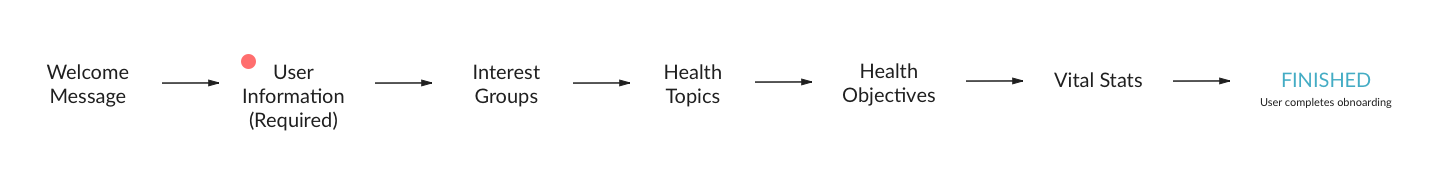
Some important points to note for the new feature is the following:
- Clients using the Sprout platform have the option of using the Sprout HRA or an external third party HRA provider
- Sprout allows users the ability to connect select wearables (Garmin, Fitbit, and more) to the platform for automatic data collection. While a wearable is not required to use the platform itself, users must connect a wearable for the platform to collect the data needed (approximately 7 days’ worth of data) to generate the HRA results
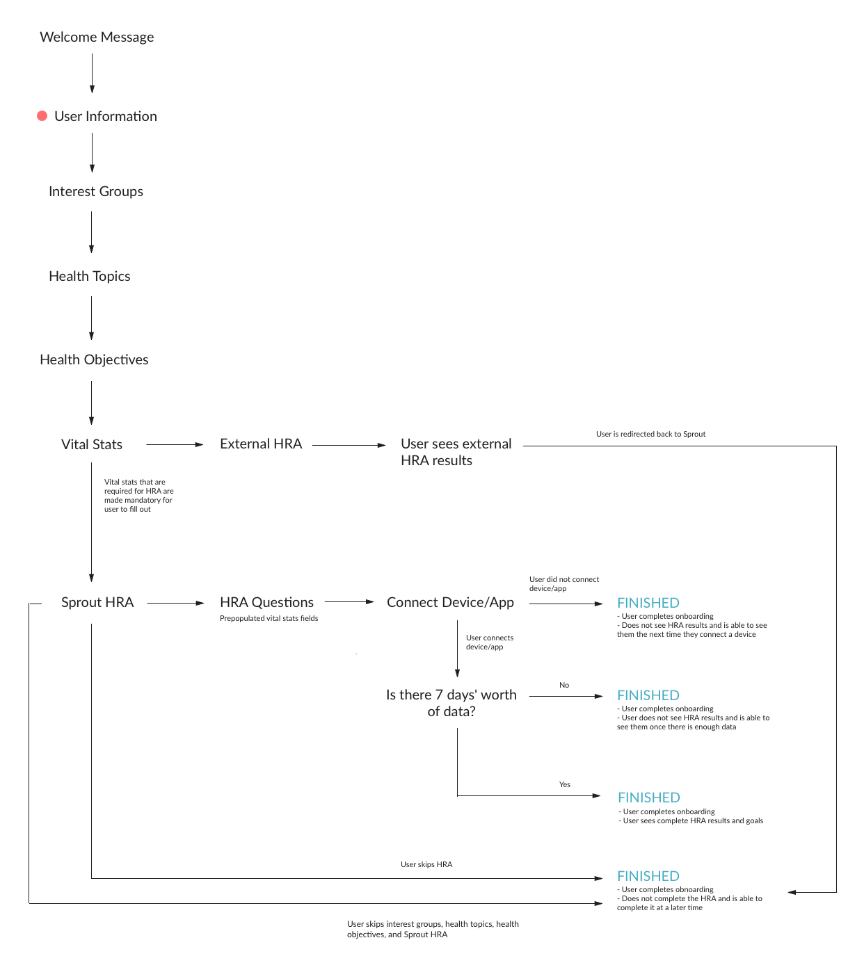
Given the points listed above, to ensure that all edge cases are covered, I created the workflow below to identify all of the possible scenarios that could occur for a user going through the new registration flow.
The Solution
Guided and engaging questionnaire that accounts for all edge cases
The end result was a guided questionnaire that was informative, engaging, and easy to digest. The survey was broken down into smaller subsections to avoid information overload and provided users with the flexibility of completing what they wanted, when they wanted to.
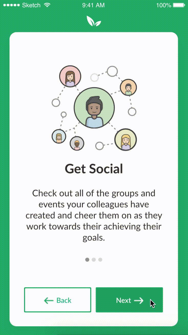
Value Propositions
An important aspect of the registration flow is to provide context to users as to what the platform can offer and how it can benefit them. To accomplish this, value proposition screens were designed for the purpose of educating users and outlining the values of the platform.
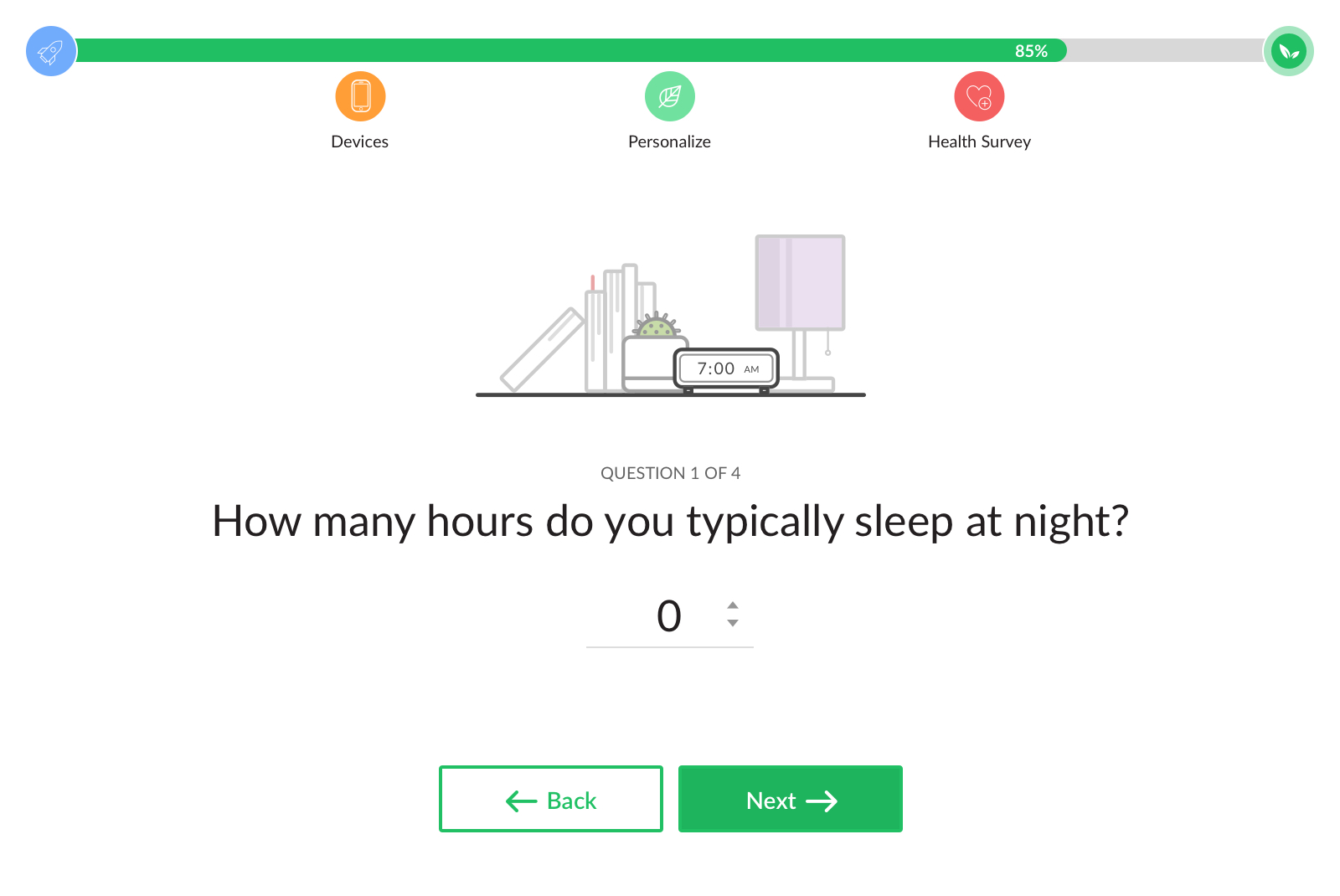
Assessment Questions
To avoid information overload, the survey was designed to present every question on a per-question basis. This approach established focus on the current question and prevented users from diverting their attention to other distracting elements. The progress bar, fixed to the top of the modal, indicates the current section and how far along the users are in the survey. This provides users with foresight and motivation to complete the survey.
Illustrations
Lastly, to add to the overall experience of the survey, I created a series of fun illustrations to accompany every value proposition, question, and edge case (empty states, specifically). These illustrations provide visual context to the information and made the survey more digestible as a whole.
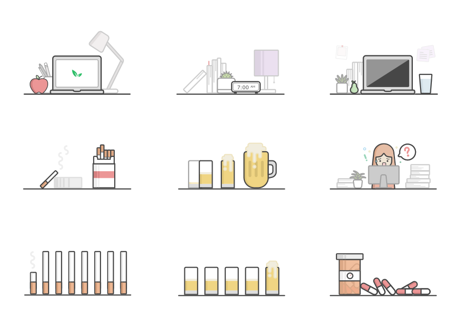
Lifestyle illustrations used to accompany every question
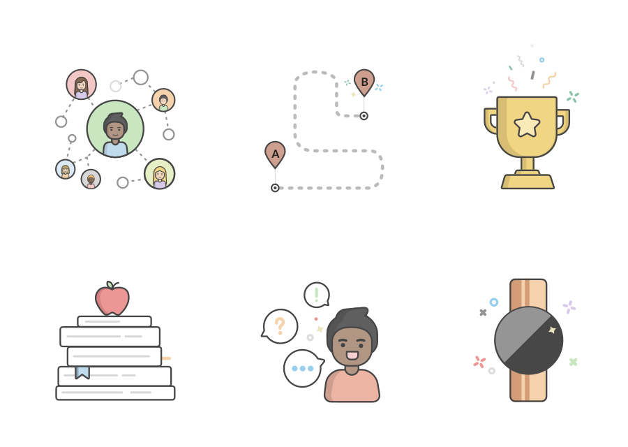
Illustrations used on value proposition screens
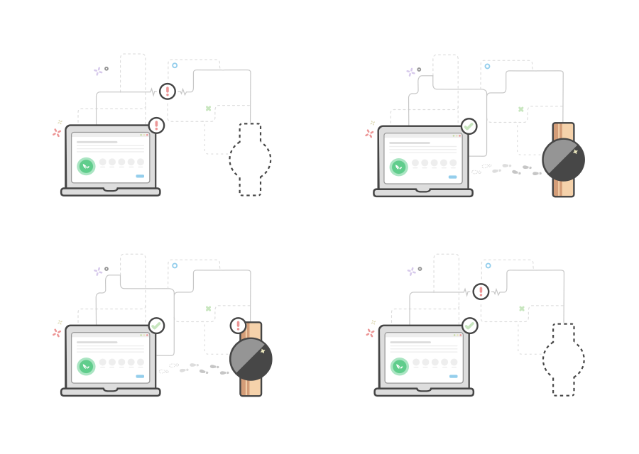
Edge case illustrations (used on error screens)